If you join Rollercoin clicking on this banner I will get some rewards, give it a try!

Showing posts with label design. Show all posts

Wednesday, August 20, 2014

Some tips/tech for drawing.

This entry is dedicated to my beautiful and talented niece Victoria who is interested in all this jazz since she made her mind and wanted to study design, I saw once her illustrations and a nice elephant she did reminded me of this old trick.

The is dedicated to you, too. This post may help you in giving you a somewhat rudimentary technique which involves erasing in order to create light on objects drawn with pencil.

Step One: The Drawing.

To give light to any object first you do is visualize the object in your mind, its proportions and how would it be if it is three-dimensional. For instance, if we visualize a ball, you can "feel" its roundness in your mind and start imagining where would the light hit it if is set overhead, the upper parts is clear while the bottom is darker.

When it comes to more complex objects, for example, an animal, a rock or some irregular shape, then you are going to use your imagination a lot to visualize these objects before using some lightning or shading.

Well, this is the Furroduck's outline.
For this case I decided to go with some weird animal I imagined right out the bat, sorry :) I named it the Furroduck, or whatever you like to call it. Once you're done with the outline drawing you start to get a better idea how would you like it filled using your crayons or pencils.

In my imagination I tried to shape its muscles and many body parts as rounded as it can be to give it more mass, while it has more mass it is more interesting to see, in the case you're going for reallistic drawing.

Step Two: Filling.

The order in which you
sould apply the pencil.
Filling would "color" the shape you did, since we are working with pencils it would be very nice if you familiarize with the density of the material you are using. For this technique I would suggest you to use F, FB, or HB pencils which trace is very light and is easy to erase. It is important here that you don't fill anything without an order, if you start making directionless strokes you would probably get a mess where some parts are darker than others and you just don't feel any uniformity around your drawing. You're aiming to get it as flat and opaque as possible.

For that purpose, you can use your HB in a fixed direction for the first pencil layer, as it shows in the 2nd pic.
The first layer doesnt have to be perfectly
uniform, you just have to do it.
This is the part of making a drawing where you get totally absorbed by it. In my particular case I feel like I do not belong to myself and is a very abstract feeling. Working on a texture does not require a lot of concentration, it just requires all the contrary; plug yourself off and pour yourself in the drawing. Sorry if I exceeded my words, but Hey! is what I feel while doing it! :)

If you don't have any graphite drawing pencil you may resort to mechanical pencils and the trace will be much more uniform without having to worry about the hassle of sharpen the pencil.

In this case it didn't take me too long to complete the 1st. layer of filling. In order to make it uniform you need to apply several layers to the shape, as in the avobe pic you may want to draw the first in a direction and the second on the opposite way.

And then erase on the points where the
light hits, caring about the outline.
Once you are done with the second layer you may have a much more uniform "coloring" on the shape, and you will feel much better whatever it ails you. Kinda therapeutic. You may try to make the second layer with the same intensity of darkness with which you drew the first. You know, uniformity-ish-ly.

Part Three: Erasing

Here is when it gets cooler. You can use either the back of a pencil for precission or a big eraser for covering more space. Whichever the case you will employ your imagination here more than in the previous steps.

For the lightning I went for the classics and I'll put the lights as if they were in a room, right above its head, and started erasing the upper parts of the drawing. The shoulder, the head, the ear, the cheek, and the back line were in my priority list for erasing. If you screw this part erasing bigger parts there's little to be done for fixing it. just be careful and erase conciously.

Not finished, but there you can get the
idea of what you got to do.
And for the shading part you want to use a third or fourth layer of pencil to get them really dark. Try here to use any B pencil you got around, my favourite is 5B which is very dense and leaves a real mess of dust as well as a big amount of "valor" in Spanish. Which means "intensity" in illustration terms. My teacher used to say "Si no le pones valor a tus dibujos, no tienes valor!! tienes que ser valiente!!" (if you don't put valor to your drawings, you have no bravery! you gotta be brave!"... good times those, I loved that teacher.

And there you go! This technique is very rudimentary since the best way to apply lightning on a drawing is not filling on the white parts. Doing so will make the white of the paper itself to stand out. By erasing you are automatically pushing graphite dust particles inside of the paper holes, darkening it in the process.

Additionally you may want to polish the coloring by brushing the "layers" with your finger on the dark parts of the drawing, doing so you smoothen the texture in the coloring layers and it will look much more finished.

Well, I hope this can be useful for you, and you can practice a bit too in the future. I would like to hear your comments, observations, critique and much other things. Have a great week.


Monday, February 13, 2012

La vida personificada

Hola blog, esta vez actualizaré con este último trabajo de ilustración.

En un post de FB, una conocida, Astrid, comentó que "Life is a serious thing, but beautiful!" y pensé como es la vida para mi, como la veo yo, y me puse a personificarla. Una vez que terminé mi trabajo, el hijo de la señora quien me alquila la habitación (un conferencista de temas holísticos y coaching) me dijo una vez visto el dibujo me comentó "se nota que te falta mucho que aprender, si tu ves la vida de esa manera significa que tu te dejas pegar por ella, para mi no es así" y hasta se mostró ofendido.

Esta es la chica original, yo quería una mujer que fuera hermosa, un rostro angelical, aunque después descarté la idea ya que la vida es de todos los dias, los rostros hermosos son ocasionales.

Quería un rostro desafiante y hasta con aires de crueldad. Doblado en 3 ¼, con cabellos rubios, alborotados pero hermosos.

Este modelo terminó pareciéndose a Mimi Lazo y opté por cambiar bastante su apariencia


Estos son estudios del cabello y el rostro, aquí la muestro demasiado serena en comparación con lo agitado de nuestras vidas.

Los senos quería que fueran abundantes y jugosos, aprovisionantes como la vida misma. Quería agregar flores de zarcillos por su naturaleza y femeneidad.


Terminé por elegir el modelo de cabello alborotado y peinado desde la derecha el cual es más común que abierto de la izquierda. Un estilo bastante común en Asia, por cierto.
.


El modelo de la posición de los brazos quedó así combinándolo con el cabello y el torso. Aún le faltaba algo de maldad a la mirada y comencé a esbozar otra vez.

Las manos tenían que ser femeninas pero amenazantes. Quería algo natural y amenazante, algo que dijera "peligro!" y pensé que las espinas de las rosas eran el ítem perfecto. Extraje un par de púas del rosal de la Sra. Rebeca y copié el modelo, aunque no a la perfección :P


Me tomó bastante tiempo para figurarme como iba a distribuir las espinas y que lucieran orgánicas sin pasar por mi textura ya usual de erizo... aunque terminó justo en ese punto... lol


En la Biblioteca Nacional, me le acerqué a Andréa una chica quien está estudiando ciencias políticas e historia de Venezuela. Le pedí el favor de que irguiera su puño y posara para mi, pero sólo su mano. Ella estaba en estado de shock pero entendió lo que tenía que hacer.

Me ayudó bastante ya que las manos que había hecho hasta ese momento todas parecían masculinas... bueno, no hay mucha diferencia entre manos masculinas y femeninas una vez que están cerradas en puño, pero igual me fué muy útil su ayuda.


Luego el traje tuve que hacerle unos cambios para que luciera fresco, primaveral. Se me cruzaron varias ideas por la cabeza. Uno un traje de primavera, con lazos y encaje, en el de la izquierda quería poner la parte superior con pelotas "porque a la vida hay que echarle bolas" pero simplemente quedaba demasiado deportivo.


El otro era hacer una transparencia del cuerpo desnudo al fondo y un traje de cielo arriba, sigue siendo una opción posible una vez que comience a hacer la imagen final en Photoshop.


Y esta es la chica de la vida; piel tersa, músculos en los brazos pero aún femeninos, un prendedor con los símbolos de ambos sexos imprescindibles para la vida junto con el yang y el yin, gargantilla para acentuar su hermosura, y un par de puños que te pueden herir, su mirada rebelde y desafiante, con una mueca casi sonrisa - casi burla que nos invita a explorarla mas a fondo. Un lunar seductor cerca de los labios y ojos centelleantes que penetran tus intenciones. Serena del todo pero amenazadora. Esta es la vida para mi.

Hermosa, seductora, desafiante, cruel, fuerte, dulce y única.

Gracias.

Friday, February 3, 2012

Amateur Calligraphy

Hi bloggers, I've decided to post some of my last year's work, while I had a job at the language institute I tried some ink on my nib and went on writing things. I was inspired by Park Jiyoung, the charming calligrapher who still is a distant friend. I tried to do something similar with my own language as well. While I recognize is an amateur level set of calligraphy work I got to say I like it a lot and can improve.

Eventually it was quite popular among the teachers and students at the insitute and some of them wanted their name calligraphed, then the unexpected happened. Earthquake hit Japan on full strenght and I actually was very moved. Until the date I haven't seen any of the many videos surrounding the net of the catastophic scenes that shook the whole world but I felt moved nevertheless. So I asked my students, young and old to make a donation for the Japanese Red Cross and in exchange for their compassion token they would get their names on ink on a small white paper. So I raised a "symbolic" amount of money but people didn't walk away empty handed, and I'm happy for that.

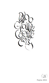
So I continued with my calligraphic work and managed to get occidental characters twisted and bent to the point of the irrecognizable state, still with a little of persistance you can find the hidden text in the middle of the images.

Even though I couldn't resist the temptation of modify through PS some of the originals I still hope you guys enjoy my work.

This is how my font started looking when I did the names on paper for Japanese Red Cross donors. More rounded, sincere and cuter.


 This one is dedicated to You Wen Ting, my ex-wife. We know why : D

The scanning didn't help much to this one, it makes it look too sharp and contrasted. When I did this text I was looking for words of courage to overcome the situation at home, I used to get yelled by my landlady a lot, she's a maniac.


 There was an issue here, because the original actually had a typo. Well, Photoshop magic on the last N which was actually a D.

I liked this little one a lot, it took me a very long while to make the letters in a straight horizontal line without making mistakes, there still are but there aren't as bad as the sketches.
 Here I wanted to give my work a twist, I remembered how Gaudi's buildings looked like and wanted to make something tortured, smoked but legible and amusing.

Some exercises with repetitions, I didn't want my practice sessions making it into the page, sorry.


I thought "well I got to sell my work, so what better seller than the most iconic religious figure throughout the world?" lol, seriously I wanted to do words which people can easily recognize and appreciate.

 ... yeah, this one too. Simple, well rounded and easy to read.

No, I didn't do this right after watching 300. The word was surrounding my mind. I wanted so bad to put it into paper. The lacy, loopy and open faced characters used above... simply wasn't going to fit. This is a calligraphic exercise with personality and low pitched voice.

This one is dedicated to all the System of a Down fans.


 Later on, my main font morphed into this thin and tall style, notice it keeps the lower left and upper right drops.


This is a small detail from the previous one, poetic and full of expression old school types can be done as well in modern times. I envisioned this one as the font for a national television drama's name.


 Here I was actually looking for ideas, to the point of trying to do it in Korean as well, I want to learn how to type with brush as they do but for now I'm quite happy with the quill.

 This was a one out of the very few drawings that made the cut into my scanned calligraphic exercises. I dedicated it to Dita Von Teese. it reads "slenderness".

The letters, the person who is dedicated to as well as the pic is filled with sensuality, I hope they like it.

It does look like the Eurobuilding's logo, but wasn't done with that in mind. I wanted to do a bigger texture and looked good.

 This very thin font was made with lots of bracket shapes and gothic inspirations, I wanted to do those written boards which you hang on lintels or refrigerator lids. It feels mature, antique and sober.
Here's another example of the previous but a little bit less thinned. This actually is the last one I did, much more perfected than the previous one. Straighter and better looking.


Some Venezuelan proverb which is used when you get the same bad result whenever you're trying two different options. I wanted to get back to the festive, oscillant type and I did.


Another common saying also made it into a song, mixed with the cup drawing, I liked this a lot even though of the typo.

 One of my earliest works, I really like the simplicity, openness and sincerity this font reflects. I like it.

More culture slang on my art, when you keep hearing some words, tongtwisters, sayings and proverbs, they float to your memory like driftwood when you're looking for something smart to write up, one of my favorites no doubt.

This has been my most enigmatic work. It reads a children song which we learned on kindergarten, I had to transform each syllable into a aesthetic element which had a real relationship with the other ones. At the end you may just think they are similar elements put together creating a harmonic interaction when is NOT just that! there's text there, transformed and created to bend your brains out, people laughs a lot when they find out what's written.


Some of my most experimental work, my calligraphy even in amateur state doesn't go along well with symmetry and linearity, I wanted to write something in English but didn't mean to write it differently as the Spanish ones, simply came up like this :)

These are some very elegant pieces, where some interesting words got all laced and spiralled up. Again, you might think there's just some nice lines in the image but there's more that that, I made sure to put the answer to the puzzle below.

And this is it, if you like it share it on FB or Twitter and contact me if you want to get your name or text written, I'll post it on this blog as soon as I get it. Have a good day and spread the word!